Black and White Wedding Signs for Modern, Formal and Editorial Suites
Black and white wedding signs give couples a clean, formal, editorial look that works across welcome signs, seating charts, bar menus, itineraries, and newspapers.
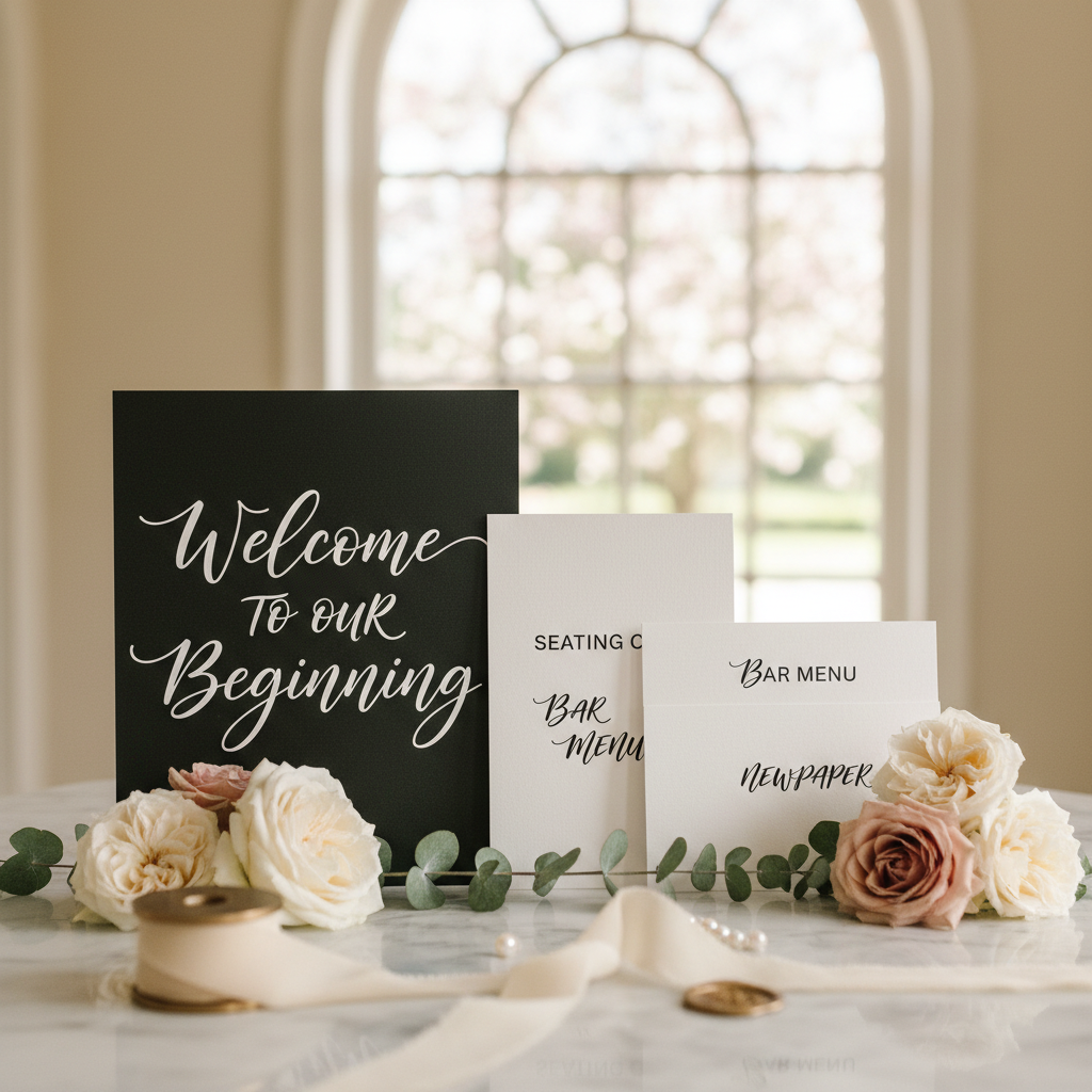
Black and White Wedding Signs for Modern, Formal and Editorial Suites
Black and white wedding signs work because they solve two design problems at once. They make the signage feel polished and cohesive, and they remove the color noise that often makes a wedding suite feel less intentional. A black and white palette can look formal, minimal, editorial, romantic, or fashion-led depending on the typography and materials you choose, which is why black and white wedding signs stay relevant across so many different venue types.
That flexibility is what makes black and white wedding signs such a strong theme page. This is not one narrow aesthetic. It is a broad direction that can serve a black-tie hotel, a gallery-style city wedding, a candlelit restaurant reception, or a newspaper-inspired editorial weekend. When couples want signage that photographs well and feels clean from start to finish, monochrome usually wins.
This guide breaks the style down by mood, material, sign type, and common wedding use cases so you can decide whether black and white is the right direction for your suite. If it is, you can turn the look into a finished design with AI Wedding Signs.
Why Black and White Wedding Signs Work So Well
Black and white wedding signs feel intentional because the palette removes distraction. Guests focus on the typography, the structure, and the message. That creates a stronger impression than a sign that relies on a color trend but has weak hierarchy.
The style works especially well because it:
- photographs cleanly
- stays readable in many lighting conditions
- matches formal attire easily
- supports both classic and modern typography
- scales across signs and posters without feeling repetitive
This is also one of the safest directions for couples who want to mix materials. Acrylic, foam board, linen print, framed art paper, mirror, and matte poster stock can all work inside a black and white wedding signs suite.
The Different Moods Inside Black and White Wedding Signs
Black and white wedding signs can go in several directions. Choosing the right branch matters.
Minimal and Modern
This version uses:
- wide spacing
- clean serif or sans typography
- very little ornament
- strong contrast
It works well for:
- city venues
- modern lofts
- gallery weddings
- simple floral programs
This is the direction couples usually mean when they say they want the suite to feel “clean.”
Formal and Traditional
This version uses:
- classic serif typography
- balanced centered layouts
- names and dates with more structure
- framed or matted presentation
It works well for:
- ballroom weddings
- church ceremonies
- hotel receptions
- black-tie events
Editorial and Fashion-Led
This version borrows from magazines and newspapers:
- bold headline scale
- sharper hierarchy
- asymmetric layouts
- more confident white space
It works especially well with a wedding newspaper, order of events sign, or large wedding details poster.
Romantic Monochrome
Black and white does not have to mean severe. Softer scripts, ivory paper tones, and candlelit styling can make the palette feel romantic and quiet rather than strict.
This is a strong direction for:
- intimate dinners
- winter weddings
- candle-heavy receptions
- fine-art floral aesthetics
Best Sign Types for a Black and White Wedding Signs Suite
The beauty of black and white wedding signs is that the palette works across the entire suite.
Welcome Signs
Black and white welcome signs often look strongest with:
- generous margins
- two or three lines only
- elegant serif or restrained script pairings
- matte print or framed board presentation
This is one of the easiest sign types to make feel expensive with a minimal palette. Start with the welcome signs page if you want the commercial format first.
Seating Charts
Monochrome works especially well for seating charts because clarity matters more than decoration. Strong contrast makes names easier to scan.
Useful seating-chart choices:
- black text on white or cream
- clear table headings
- alphabetical layout for larger weddings
- bold section breaks
If scan speed matters, black and white wedding signs are one of the best directions you can choose.
Bar Menus
Bar menus in black and white can feel either classic or editorial depending on the type treatment.
Good choices:
- drink names in large serif type
- ingredient lines in smaller text
- one simple border or divider system
- minimal icon use
This style works especially well for bar menu signs that need to feel polished rather than playful.
Directional Signs
Directional signs benefit from contrast. Black and white keeps arrows and location labels readable from a distance.
This is especially useful for:
- ceremony arrows
- parking guidance
- photo booth direction
- restroom direction
Programs, Timelines, and Itineraries
Monochrome is strong for structured information. If you want guests to read quickly, black and white usually beats heavily decorative palettes.
That makes it a good fit for:
Best Materials for Black and White Wedding Signs
The material choice changes the mood of the suite even when the palette stays the same.
Matte Fine-Art Print
This creates a soft, editorial finish. It is ideal for framed signs, newspapers, and poster pieces.
Acrylic
Clear or white acrylic can make black and white wedding signs feel cleaner and more architectural. It suits modern or luxury events well.
Foam Board
This is practical and works well for larger signs that need a smooth, consistent print surface.
Mirror
Black and white styling can still work on mirror surfaces if the lettering stays restrained. The result feels more classic and formal.
Linen or Textured Paper
If you want monochrome without the suite feeling flat, texture helps a lot. It adds dimension without adding color.
Typography Choices for Black and White Wedding Signs
Typography carries more weight in a monochrome suite because color is no longer doing the mood-setting.
Strong pairings include:
- high-contrast serif + clean sans
- elegant serif + light script accent
- all-serif editorial hierarchy
- bold modern sans + restrained small caps
Weak pairings include:
- too many fonts at once
- decorative scripts that reduce readability
- trendy fonts that date quickly
If the sign set is minimal, the typography has to do real work. Do not treat it like an afterthought.
Black and White Wedding Signs by Wedding Style
Black-Tie Ballroom Wedding
Use:
- centered layouts
- formal serif typography
- names and dates
- matte white or ivory surface
City Editorial Wedding
Use:
- larger headline scale
- asymmetric or magazine-like hierarchy
- black text with strong blocks of white space
- poster formats and newspaper influence
Minimal Restaurant Wedding
Use:
- fewer words
- smaller suite footprint
- clean framed signs
- one consistent type family
Winter Candlelit Wedding
Use:
- cream or warm-white base
- softer serif faces
- romantic script accents used sparingly
- black text with warm metallic hardware around the display
How to Keep Black and White Wedding Signs From Feeling Flat
The most common fear with black and white wedding signs is that they will feel too stark. The fix is not color. The fix is dimension.
Add depth through:
- texture
- material contrast
- type scale
- framing
- florals around the sign
- layered welcome installations
You can also use off-white, cream, or soft charcoal instead of pure white and pure black if you want a slightly warmer result.
Pairing Black and White Wedding Signs With Florals and Decor
One reason the palette works so well is that it lets the surrounding decor do more expressive work.
Good floral pairings:
- white blooms with dark greenery
- all-white florals for formal minimalism
- moody foliage and candlelight
- black ribbon or dark velvet accents
Good decor pairings:
- black metal easels
- polished frames
- soft ivory linens
- clear acrylic furniture details
- editorial paper goods
The signage becomes the structure while the decor supplies atmosphere.
Poster Formats That Work Especially Well in Black and White
Black and white wedding signs often expand naturally into posters.
Strong poster matches:
This is one of the best themes for couples who want the whole printed system to feel coherent across entrances, cocktail displays, and takeaway pieces.
Common Mistakes With Black and White Wedding Signs
Using Weak Contrast
Gray on off-white may look refined on a screen but can fail in low light. Readability still comes first.
Letting Every Sign Look Identical
The palette should stay consistent, but hierarchy and layout should still shift by sign type.
Adding Decorative Flourishes Just to Fill Space
If the design feels empty, improve the composition. Do not force ornaments into it.
Forgetting Warmth
Monochrome works best when something else adds feeling, whether that is florals, texture, lighting, or better copy.
A Strong Use Case for This Theme
If you want a wedding suite that feels polished, timeless, and easy to scale across many formats, black and white wedding signs are one of the best choices available. The theme works for a single welcome sign, but it gets even better when it extends through seating charts, bar menus, posters, newspapers, and itinerary pieces.
Use AI Wedding Signs to create black and white wedding signs that match your tone, then extend the style into a welcome sign, seating chart, wedding newspaper, or editorial wedding signs direction as needed. The best monochrome suites feel less like a color limitation and more like a design decision with real confidence behind it.
Sources
- Title: 36 Simple, Beautiful Black-and-White Wedding Ideas Publisher: Martha Stewart Publication Date: December 7, 2018 URL: https://www.marthastewart.com/7963301/real-weddings-black-ideas
- Title: 30 Creative Wedding Signs That Will Welcome or Direct Your Guests Publisher: Martha Stewart Publication Date: May 12, 2023 URL: https://www.marthastewart.com/7934526/signs-real-weddings
- Title: Business Poster Design Guide: How to Create a Poster Publisher: FedEx Publication Date: Not listed URL: https://www.fedex.com/en-us/small-business/articles-insights/business-poster-design.html
Keep Exploring
Editorial Wedding Signs
Push the monochrome look further into newspaper-style and fashion-led layouts.
Wedding Newspaper Templates & Creator
Black and white is one of the strongest directions for editorial wedding newspapers.
Create a Black and White Sign Suite
Build welcome signs, seating charts, and poster pieces in a monochrome style.