Wedding Reception Signs: Essential Signage for Your Celebration
Complete guide to wedding reception signs including bar menus, table numbers, food stations, and timeline displays. Create custom designs instantly.
Your reception has a lot moving parts—cocktail hour, dinner, dancing, cake cutting, and everything in between. Good signage helps guests navigate it all without feeling lost or confused.
Think of reception signs as your silent party hosts. They answer questions before guests have to ask them, point people in the right direction, and add personality to your space. When done right, they make everything flow smoothly while looking beautiful in photos.
Create your reception signs instantly with AI and coordinate your entire suite in minutes.
Why Reception Signs Actually Matter
Your reception probably has multiple zones—cocktail area, dining space, bar, dessert table, photo booth, dance floor. Without clear signs, guests wander around trying to figure things out. They miss the signature cocktail you spent weeks perfecting. They can't find the bathroom. Someone sits at the wrong table.
Good reception signs solve these problems. They guide people where they need to go, share information (like what time dinner starts), and reinforce your wedding style. A rustic wooden sign fits a barn wedding. Sleek acrylic fits a modern ballroom.
Plus, reception signs show your personality. Funny quotes, sweet sayings, or inside jokes that mean something to you—they all add character to your celebration. And they look great in photos, which means they'll show up in everyone's Instagram stories.
When guests feel oriented and informed, they relax. They're not worried about missing something or being in the wrong place. They can focus on having fun, which is the whole point.
Essential Types of Wedding Reception Signs
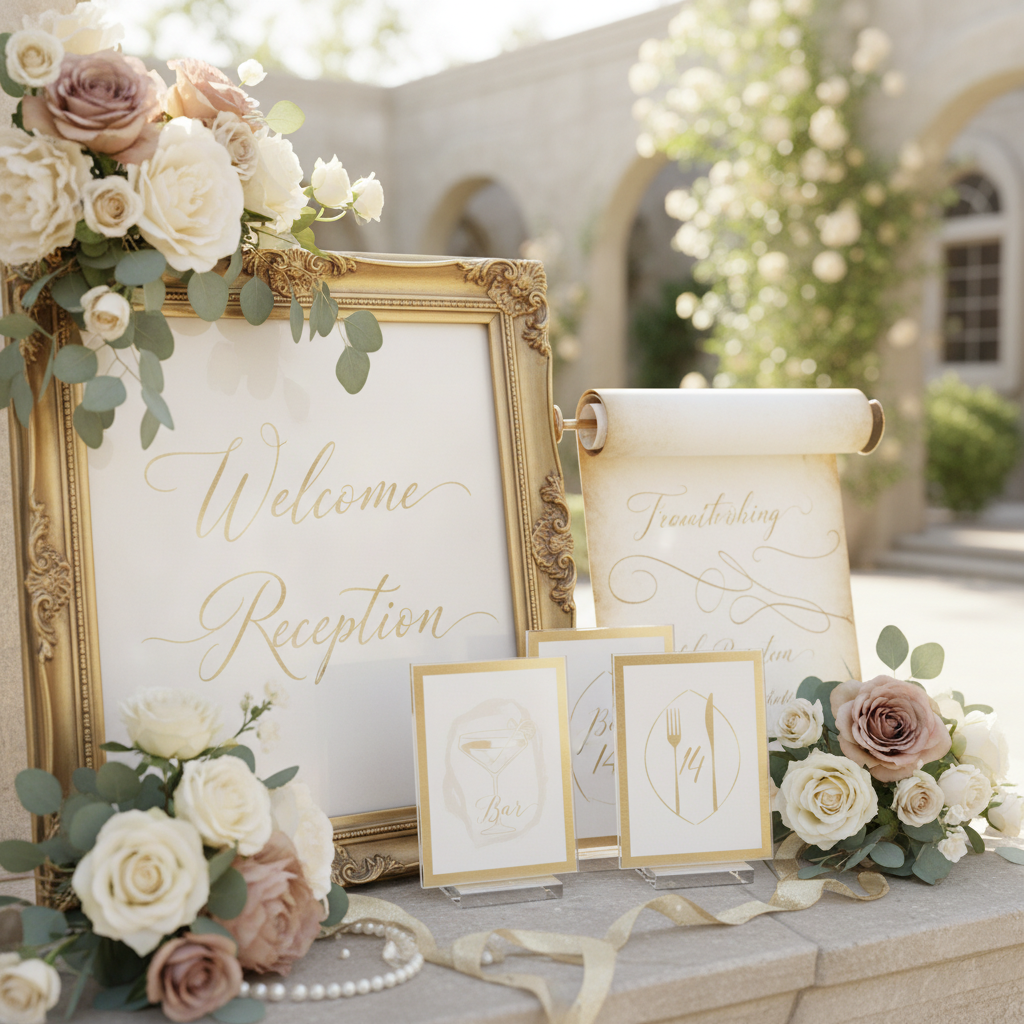
Table Numbers and Seating Displays
If you're having a seated dinner, table numbers are essential. You can go traditional with simple numbered cards in frames, or get creative with table names based on your favorite cities, important dates in your relationship, or even photos from different years you've been together.
Size matters here. Guests need to spot their table number from across the room. At minimum, go with 5x7 inch signs. For bigger venues (think ballrooms with 150+ guests), 8x10 inches works better. Acrylic catches light beautifully and looks good whether your vibe is rustic or modern.
Pair your table numbers with a seating chart display near the entrance. This combo keeps traffic flowing—guests check the chart for their table number, then scan the room to find it. Some couples skip the big chart and use individual escort cards instead.
Make sure table numbers stand up and stay visible. Laser-cut wood with stands, acrylic with bases, or framed numbers on small easels all work well. Don't lay them flat on tables where centerpieces or someone's purse will cover them up.
Bar and Beverage Signage
Your bar area needs its own set of signs. Start with a signature cocktail menu that shows off the special drinks you've created. Give them fun names (bonus points if they're inside jokes), list the ingredients, and watch as guests actually order them instead of just asking for "vodka soda."
A full bar menu listing all available drinks—beer, wine, spirits, mocktails—helps guests make decisions without interrogating the bartender. This keeps lines moving and makes everyone happier.
If you're doing a champagne wall, prosecco cart, or self-serve station, add clear instructions. A simple "Please take one" or "Help yourself" lets guests know what's expected. If escort cards are attached to champagne glasses, explain that guests should find their name and take that glass.
Behind the bar, consider a fun backdrop sign—maybe "Cheers to love" or something more playful. This creates a photo op and reinforces your wedding colors. Neon signs saying things like "Love is intoxicating" or "Sip sip hooray" add energy to cocktail hour.
Design coordinated bar signage that matches your reception's aesthetic perfectly.
Food Station and Buffet Signs
Food stations need labels. Not just because they look nice, but because your guests have allergies, dietary restrictions, and preferences. Label each dish with its name and key ingredients (especially common allergens like nuts, dairy, gluten).
For buffet setups, think in layers. A big sign announces the buffet area. Medium signs mark different stations (appetizers, mains, sides, desserts). Small cards identify individual dishes. This hierarchy helps guests navigate without getting overwhelmed.
Interactive stations—taco bars, pasta stations, build-your-own anything—need instructions. "Start here" arrows or numbered steps ("1. Choose your base, 2. Add proteins, 3. Pick toppings") keep things moving smoothly.
Mark dietary options clearly. Vegetarian, vegan, gluten-free, nut-free options should be obvious at a glance. Some couples create a master sign listing all dishes by dietary category so guests with restrictions can quickly scan and identify what works for them.
Reception Timeline and Program Signs
A timeline sign keeps everyone on the same page about what's happening when. List the major moments: cocktail hour, dinner, toasts, first dance, cake cutting, bouquet toss, last dance. This way guests know when to grab another drink versus when to find their seat.
Make it scannable. Clear headings, consistent formatting, readable fonts from a distance. A 24x36 inch sign works for venue entrances. A smaller 16x20 inch version works on tables.
You can also add program signs explaining special elements. Why did you choose that first dance song? What's the story behind your cake design? How did you two meet? These details make guests feel more connected to your celebration.
If you want an unplugged first dance or speeches, say so. A polite sign like "Please put phones away during our first dance—our photographer will capture it" sets expectations without seeming demanding.
Guest Book and Card Table Signs
Your guest book area needs clear signage directing guests to leave messages and explaining any unique format. Traditional books, Jenga blocks, puzzle pieces, or polaroid guest books all require brief instructions for guests unfamiliar with creative alternatives.
Card box signs serve two purposes: identifying where to leave cards and gifts, and providing security messaging if needed. Simple "Cards and well wishes" text makes the purpose obvious. If you're having gifts delivered elsewhere or prefer charitable donations, communicate that clearly.
Create signs encouraging specific types of messages. "Share your favorite memory," "Give us advice," or "Make us laugh" prompts inspire thoughtful guest book entries beyond generic congratulations. These prompts help guests who feel uncertain about what to write.
For digital guest books using QR codes, ensure the sign clearly explains the technology and provides simple instructions for scanning. Include a backup option for guests uncomfortable with technology—perhaps a traditional book alongside the digital version.
Dessert and Cake Table Displays
Cake cutting ceremonies benefit from signage announcing the moment. "Let them eat cake" signs in your design aesthetic create photo opportunities and draw attention when it's time for this traditional element. Position these signs where photographers can incorporate them into cake cutting photos.
If you're offering a dessert bar instead of or in addition to wedding cake, label each option clearly. Cookies, macarons, cake pops, candy displays, and specialty desserts should have individual signs with names and any relevant allergen information.
Late-night snack stations are popular reception additions that absolutely require signage. Whether you're serving pizza, sliders, donuts, or regional favorites, announce this surprise with an eye-catching sign. "Midnight munchies," "Love is sweet (and so is pizza)," or "Fuel for the dance floor" adds playful personality.
S'mores bars, hot chocolate stations, or coffee bars need both labeling and instruction. Show guests where to find ingredients, explain the process if it's interactive, and create a cohesive dessert experience with matching signage throughout all sweet stations.
Photo Booth and Entertainment Area Signs
Photo booth signage serves multiple purposes—directing guests to the location, explaining how to use the booth, and encouraging participation. "Strike a pose," "Say cheese," or "Capture the memories" signs in your wedding fonts create recognizable branding for this popular feature.
Hashtag signs encourage social media sharing while giving you an easy way to find guest photos after the wedding. Make your hashtag large, unambiguous (distinguish between O/0, I/l, etc.), and displayed at multiple locations—photo booth, bar, entrance, and near centerpieces.
If you've arranged lawn games, dancing areas, or lounge spaces, dedicated signage helps guests discover these elements. "Lawn games this way," "The dance floor awaits," or "Relax and lounge" with directional arrows ensure guests explore the full venue.
Guest favor tables benefit from signage explaining what's available and encouraging guests to take items home. "Thank you for celebrating with us—please take one" makes expectations clear. If favors are edible or have special meaning, a small sign explaining your choice adds personal connection.
Generate all your reception signs in a unified design system for cohesive branding.
Send-Off and Exit Signs
As your reception winds down, exit signage guides guests to the conclusion. "The party doesn't end here" with information about after-parties helps guests who want to continue celebrating know where to go. Include address, time, and any relevant details.
Sparkler send-off stations need clear instructions for safety and timing. "Light a sparkler," "Wait for our exit," and "Hold them high" instructions ensure beautiful photos and safe execution. If your venue prohibits sparklers, alternative send-off signs (bubbles, streamers, glow sticks) provide similar guidance.
"Thank you" signs at exits leave guests with warm feelings as they depart. Simple messages like "Thank you for making our day unforgettable" or "Forever grateful for your presence" offer heartfelt closure to the celebration.
Transportation signage eliminates confusion about shuttle schedules, taxi stands, or parking validation. "Shuttles depart every 15 minutes," "Valet service ends at midnight," or "Safe travels home" helps guests plan their departures smoothly.
Design Considerations for Reception Venues
Indoor and outdoor receptions need different approaches. Inside, you can use lighter materials like paper or fabric. Outside, go weather-resistant—acrylic, sealed wood, or laminated prints that won't curl in humidity or blow away in wind.
Venue size affects sign size. A huge ballroom needs big signs readable from 30-40 feet away. An intimate restaurant space calls for smaller, more detailed signage. Before you print, test by viewing samples from the actual distance guests will see them.
Ceiling height matters if you want hanging signs. High ceilings with exposed beams can handle suspended signs or geometric hanging installations. Low ceilings mean you'll stick with floor stands and table displays.
Think about how guests move through your space. Put directional signs where people naturally pause—entrances, hallway corners, doorways between rooms. Table signs should work with your centerpieces, not fight them for attention.
Lighting is huge for visibility. Dimly lit romantic venues might need backlit signs or at least very high contrast between background and text. Bright spaces handle anything. Watch out for glare if you're using metallic finishes or acrylic—test how they photograph in your venue's specific lighting.
Material Recommendations for Indoor Receptions
Acrylic signs offer modern elegance with remarkable versatility. Clear acrylic with white or metallic printing creates floating text effects that photograph beautifully. Acrylic works equally well for contemporary, romantic, or industrial themes and handles various printing methods from direct printing to vinyl application.
Wood signs provide warmth and texture suitable for rustic, bohemian, or natural themes. Options include stained wood with painted lettering, engraved designs, or even wood slices for smaller signs. Birch, pine, and walnut each offer distinct aesthetics. Seal wood signs even for indoor use to protect against moisture from drinks or handling.
Foam board delivers budget-friendly impact for large signs. Professional printing on foam core creates substantial displays at reasonable costs. Foam board works well for easel-mounted signs like seating charts, timelines, or welcome messages. The rigid surface provides clean presentation without expensive framing.
Framed prints offer traditional elegance and protection. Standard frame sizes from 5x7 to 24x36 inches accommodate any sign need. Frames elevate printed designs while providing structure and easy display. Mix frame styles—gold, silver, black, white, wood—to create visual interest or maintain consistency throughout your suite.
Canvas provides texture and sophistication suitable for romantic or elegant receptions. Canvas signs feel substantial and luxurious, particularly effective for larger displays. The material hides printing texture better than paper and creates gallery-quality presentation for meaningful quotes or special messages.
Mirror signs create stunning visual impact, especially for calligraphy or modern typography. Write or print on mirrors directly, or apply vinyl lettering. Mirrors reflect light and surroundings, integrating seamlessly with various decor styles. Particularly effective for welcome messages, seating charts, or bar menus.
Paper and cardstock signs work beautifully for detailed designs, watercolor effects, or intricate patterns. Heavyweight cardstock (110lb or heavier) provides structure for smaller signs like menu cards, table numbers, or place cards. Paper suits budget-conscious couples without sacrificing style when designed well.
Coordinating Reception Signs with Your Wedding Theme
Your reception signage should feel like a natural extension of your overall wedding aesthetic, not afterthoughts added last-minute. Start with your color palette, typography choices, and decorative motifs established in your invitations and other stationery.
Classic elegant themes suit formal calligraphy, serif fonts, and traditional layouts. Stick to your wedding colors—often neutrals with metallic accents—and maintain consistent spacing and alignment. Materials like acrylic, mirrors, or framed prints in gold or silver finishes reinforce elegance.
Rustic or barn wedding themes call for wood signs, kraft paper, hand-drawn elements, and relaxed typography. Incorporate natural textures, twine, greenery, and handwritten fonts. Laser engraving on wood or chalkboard-style designs suit this aesthetic. Allow some organic imperfection to enhance authenticity.
Modern minimalist receptions shine with clean lines, sans-serif fonts, ample white space, and geometric shapes. Acrylic signs with simple black or white text create contemporary sophistication. Limit decorative elements and let typography speak for itself. Consistency in spacing and alignment is crucial.
Bohemian themes embrace mixed materials, eclectic fonts, watercolor elements, and flowing designs. Combine wood with fabric, incorporate pressed flowers, and vary sign sizes organically. Handwritten scripts mixed with casual serif fonts create boho charm without feeling chaotic.
Garden and floral themes deserve botanical illustrations, soft color palettes, and romantic fonts. Frame signs with greenery or floral elements, use watercolor backgrounds, and incorporate nature-inspired motifs. Ivory, sage, blush, and terracotta colors enhance garden aesthetics.
Beach and coastal weddings benefit from light, airy designs with blue accents, driftwood materials, and weathered textures. Incorporate shells, sand dollars, or wave motifs subtly. Choose colors reminiscent of ocean and sky—navy, aqua, sandy beige, and crisp white.
Vintage themes call for antique-inspired fonts, sepia tones, lace details, and ornate frames. Reference historical periods through typography choices—Art Deco, Victorian, Mid-Century Modern—and maintain era-appropriate consistency. Weathered or distressed finishes enhance vintage authenticity.
Design reception signs matching your exact theme with AI that understands aesthetic cohesion.
Strategic Placement Throughout Reception Space
Sign placement dramatically impacts functionality and visual flow. Create a hierarchy of importance—guests see entrance signs first, then directional signs, and finally table-level details. This logical progression guides guests naturally through your reception.
Position your most important sign—typically a welcome message or seating chart—immediately inside the reception entrance where all guests must pass. This creates a natural gathering point and sets the tone for the entire reception. Ensure adequate space around this sign to prevent bottlenecks during arrival.
Bar areas should display drink menus at eye level (approximately 5-6 feet high) where guests can read while approaching or waiting. If you have multiple bars, replicate signage at each location for consistency. Signature cocktail signs can be slightly more decorative and positioned as photo opportunities.
Food stations require signs placed before guests reach the food to explain the station's contents and any relevant instructions. Position dietary restriction information prominently at station entrances rather than hidden among dishes. Elevated signs on stands ensure visibility even when people crowd around food.
Table numbers must be visible from multiple angles as guests circulate looking for seats. Place them toward the center of tables, elevated slightly above centerpieces. Avoid corners where guests sitting at that spot obscure the number from everyone else's view.
Timeline signs work best on easels near entrances or in central locations where guests naturally gather—near bars or lounge areas. Duplicate this information if you have a large venue where all guests won't see a single location. Digital displays can show timelines if your venue supports screens.
Photo booth signs belong both at the booth entrance to draw attention and inside the booth area to encourage use. If your booth is tucked away, add directional signs along the path leading guests to discover it. Hashtag signs should appear wherever guests might photograph—multiple locations increase adoption.
Dessert and cake table signs create focal points for these displays. Position them where photographers can incorporate signs into food photos. Larger "Let them eat cake" style signs work behind or beside the cake, while individual dessert labels should be directly in front of their items.
Restroom directional signs prevent awkward wandering. Place these near entrances and at hallway decision points. Keep them tasteful but clear—guests appreciate guidance without having to ask. If restrooms are far from the reception space, consider multiple signs along the route.
40+ Wedding Reception Sign Ideas
- Welcome to our happily ever after
- Find your seat (for seating chart displays)
- Please sign our guest book
- Sip, sip, hooray (bar area)
- Signature cocktails (with recipe details)
- Open bar - drink up!
- Love is brewing (coffee station)
- Love is sweet, take a treat (dessert table)
- Let them eat cake
- Midnight snacks
- How sweet it is to be loved by you (dessert signage)
- Cheers to love, laughter, and happily ever after
- Our love story timeline
- Tonight's agenda
- Order of events
- Turn off your phones, turn up the love (unplugged ceremony)
- Choose a seat, not a side - we're all family
- In loving memory (memorial table)
- Cards and wishes
- Your well wishes mean the world to us
- Share a memory
- Advice for the bride and groom
- Date night ideas (guest book alternative)
- Sign our guest book (with specific instructions)
- Hashtag: [YourWeddingHashtag]
- Share the love (social media)
- Capture the moment (photo booth)
- Strike a pose
- Photobooth props - have fun!
- Dance the night away
- Dance floor this way
- Lawn games (with directional arrow)
- Grab a blanket and cozy up (lounge area)
- Restrooms (with arrow)
- Bar menu - full drink list
- Dinner is served
- Thank you for celebrating with us
- Table number designs (1-40+ as needed)
- Reserved (for specific tables)
- Sparkler send-off instructions
- Thank you for making our day complete (exit sign)
- The party continues at [after-party location]
- Safe travels home
- Favor table - please take one
- Cheers to forever
- And they lived happily ever after
Customize these phrases to match your personality, replace generic wording with specific details, and adjust formality to suit your celebration style. The most memorable signs reflect your unique story and relationship.
Generate personalized reception sign phrases tailored to your specific celebration.
Budget-Friendly vs Premium Reception Sign Options
Budget-conscious couples can create stunning reception signage without excessive spending. DIY printed signs on cardstock, foam board, or home-printed designs save substantially while still looking professional. Free design tools like Canva offer templates specifically for wedding signs that non-designers can customize easily.
Print signs at local office supply stores on heavy paper or cardstock, then display in affordable frames from craft stores or discount retailers. Dollar stores often carry basic frames in standard sizes that work perfectly for reception signage. Spray paint mismatched frames in your wedding colors to create cohesive looks.
Chalkboard signs using actual chalkboards or chalkboard paint on various surfaces provide budget-friendly rustic charm. Paint old frames with chalkboard paint, write your messages with chalk markers, and create custom signs for under five dollars each. Chalkboards are reusable, sustainable, and photograph beautifully.
Digital printing at professional print shops offers middle-ground pricing. Upload your designs and have them printed on quality materials at reasonable costs. Many print shops offer wedding packages with discounted rates for multiple signs. Compare local and online printing services—online often provides better pricing with shipped delivery.
Premium reception signs involve custom calligraphy, specialty materials, or professional design services. Hand-lettered signs by calligraphers cost significantly more but provide unique, artisanal beauty impossible to replicate digitally. Expect to pay $50-200+ per sign for professional hand-lettering depending on size and complexity.
Laser-cut wood or acrylic signs require specialized equipment and professional fabrication. These premium options create dimensional, sculptural elements that elevate reception design. Prices range from $75-300+ per sign depending on size, material, and design complexity. The investment creates heirloom-quality pieces.
Illuminated or neon signs command premium prices ($200-1000+) but create unforgettable impact. Modern LED neon provides safer, more affordable alternatives to traditional neon while maintaining that coveted glowing effect. These signs double as reception decor and photo backdrops, potentially justifying higher investment.
Custom artwork or watercolor designs by professional artists provide one-of-a-kind reception pieces. Commission artists to create illustrations, portraits, or decorative elements unique to your relationship. Prices vary widely based on artist reputation and project scope but typically start around $100 per piece.
The smartest approach combines budget and premium elements strategically. Invest in a few statement pieces—perhaps a large welcome sign and seating chart—while using budget-friendly options for smaller, functional signs. This allocation maximizes visual impact while managing overall signage costs.
DIY Tips for Creating Reception Signage
Start with a consistent design system before creating individual signs. Choose 2-3 fonts maximum (one for headlines, one for body text, optional accent font), establish your color palette, and define spacing standards. This consistency makes even simple DIY signs look professionally coordinated.
Invest in quality printing if you're going the printed route. Home inkjet printers often produce less vibrant results than professional printing services. For important signs, spend the extra few dollars on professional printing—the quality difference justifies the minimal cost increase.
Use proper design proportions and white space. Beginning designers often cram too much information into small spaces or create unbalanced layouts. Leave adequate margins (typically 0.5-1 inch on all sides), don't center-align everything (left-aligned text often reads better), and embrace white space as a design element.
Test sign sizes before final production. Print small versions, place them in your venue or similar spaces, and view from expected distances. Signs that look perfectly legible on your computer screen may be completely unreadable from 20 feet away in a dim venue. Always size larger than you initially think necessary.
Create templates for repeated elements like table numbers. Design one perfect table number template, then duplicate and simply change the number for each table. This ensures perfect consistency and saves significant time compared to designing each individually.
Mount signs properly for professional presentation. Foam board backing stiffens paper signs, proper frames protect and elevate designs, and quality stands or easels display signs securely. Flimsy, curling, or fallen signs undermine even beautiful designs—invest in proper mounting and display materials.
Consider hiring a designer for templates while handling production yourself. Many designers offer template packages—they create the design system and main templates, you customize text and print. This hybrid approach provides professional design at fraction of full-service costs.
Proofread ruthlessly before finalizing. Have multiple people review every sign for spelling, grammar, timing accuracy, and factual correctness. It's devastatingly easy to overlook errors in your own work. Triple-check names, dates, times, and any factual information like addresses or phone numbers.
Plan assembly and transport logistics. Large signs need protective covering during transport. Bring backup mounting materials, extra tape, and emergency supplies to your venue. Signs inevitably fall, get damaged, or need adjustments—prepare for inevitable issues with backup materials and plans.
Working with Venue Lighting for Optimal Sign Visibility
Venue lighting dramatically affects sign readability and visual impact. Visit your venue at the same time of day as your reception to assess actual lighting conditions. Morning tours don't reflect evening reception lighting, and ambient daylight through windows changes dramatically from afternoon to evening.
Dark, romantic lighting creates ambiance but challenges sign visibility. If your venue features dim mood lighting, choose sign materials that catch available light—metallic finishes, acrylics, or light-colored backgrounds. Avoid dark text on dark backgrounds in dimly lit spaces regardless of how beautiful they look in daylight.
Uplighting and pin spotting can highlight important signs. Discuss with your lighting vendor which signs need dedicated lighting—seating charts, welcome signs, and timeline displays are top priorities. Even simple uplights placed under signs dramatically improve visibility and create elegant glow effects.
Backlit signs ensure visibility in any lighting condition. Light-up marquee letters, neon signs, or signs with LED backing stand out regardless of ambient lighting. These solutions work particularly well for hashtag signs, photo booth areas, and welcome messages where you want guaranteed visibility.
Consider candlelight's yellow tones when selecting sign colors. If your reception features extensive candlelight, cooler colors (blues, purples) may appear washed out or gray while warm tones (creams, golds, blushes) glow beautifully. Test your color choices under similar lighting before finalizing designs.
Avoid placing signs in glare zones. Spotlights hitting glossy surfaces create bright spots that obscure text. If your venue has stage lighting or strong directional lighting, position signs to side of direct beams rather than directly in their path. Matte finishes reduce glare compared to high-gloss materials.
Take advantage of natural light for daytime receptions. Position signs near windows where natural light illuminates them beautifully for photos. Be aware that bright sunlight can wash out pale colors—increase contrast between text and backgrounds for maximum readability in bright conditions.
String lights and bistro lighting provide excellent ambient illumination for signs. If your venue features these romantic lighting elements, position signs within their glow. The warm, diffused light creates perfect conditions for both sign readability and photography.
Making Reception Signs Interactive and Engaging
Interactive signs transform passive information displays into memorable experiences. Guest participation elements create engagement while serving functional purposes. Consider signs that require guest action rather than just reading.
Jenga guest books, where guests sign blocks with messages, combine signage with entertainment. The sign explains the concept and encourages participation. Similar approaches include puzzle pieces guests sign, fingerprint trees, or wine bottles guests sign for specific anniversary years.
Polaroid photo stations with signs asking guests to snap a photo and leave it in your guest book create lasting memories. The sign provides instructions, explains the concept, and shows examples. Guests love interactive elements that result in physical mementos.
Advice cards stations with clever prompts generate meaningful interaction. Signs like "The secret to a happy marriage is..." or "Date night ideas" encourage guests to share wisdom. Display blank cards, writing utensils, and clear instructions on attractive signage.
Game stations need instructional signs explaining rules and encouraging participation. Lawn games like cornhole, giant Jenga, or bocce ball benefit from signs with basic rules for guests unfamiliar with games. Add playful tournament brackets or score keeping for competitive guests.
Mad Libs style guest book alternatives require signs explaining the process. Provide fill-in-the-blank cards where guests create funny stories about your relationship. The explanatory sign makes the concept clear and encourages creativity.
Wishing stones or message stones stations need signs explaining the tradition. Guests select stones, write wishes, and place them in decorative containers. The sign explains the concept's meaning and instructions, transforming simple rocks into meaningful keepsakes.
Recipe cards for newlywed cooking ask guests to share favorite recipes with tips. Signs explain the request and provide blank cards. This creates a personal cookbook of recipes from loved ones you'll treasure while learning to cook together.
Create interactive reception signage that engages guests beyond simple wayfinding.
Coordinating Reception Signs with Other Wedding Stationery
Your reception signs should feel cohesive with invitations, programs, menus, and other wedding stationery. Consistent design language ties all elements together into a unified brand identity for your wedding. Guests notice (consciously or subconsciously) when elements complement versus clash.
Match fonts between invitations and signage. If your invitations feature specific headline and body fonts, carry those exact choices through to reception signs. Font consistency is the easiest way to create visual continuity. Most invitation designers can provide font names if you want to replicate their designs.
Color palette consistency matters tremendously. Pull colors directly from invitations rather than approximating. If your invitations feature dusty rose and sage green, use those exact shades in reception signage rather than similar but different tones. Even slight variations disrupt cohesion.
Repeat decorative elements from invitations in signage. If invitations include botanical illustrations, incorporate those same illustrations (or similar style) into signs. Geometric borders, watercolor washes, or ornamental details should echo across all printed materials.
Consider paper texture and weight across all printed elements. If invitations use textured cotton paper, similar paper for printed signs maintains tactile consistency. While not all signs need identical paper, the quality level should feel comparable—don't pair luxury invitations with cheap-looking signage.
Work with the same designer for invitations and signage when possible. Professional designers create cohesive suites including invitations, day-of stationery, and signage. This ensures perfect consistency and saves you effort coordinating elements. Many designers offer package pricing for complete suites.
Maintain similar formality levels across all stationery. Formal engraved invitations pair awkwardly with casual handwritten signage. Rustic kraft paper invitations look mismatched with ultra-modern acrylic signs. Ensure your signage formality level reflects invitation tone.
Timeline your design process to enable consistency. Finalize invitations first to establish your design direction, then create signage referencing those design decisions. Attempting to design everything simultaneously often results in disconnected elements that don't quite harmonize.
Real Wedding Reception Sign Examples and Inspiration
Modern minimalist receptions showcase the power of restraint. One couple used exclusively clear acrylic signs with simple black sans-serif typography throughout their urban loft reception. Each sign—from cocktail menu to table numbers—featured identical formatting with only text changing. The consistency created striking sophistication.
Rustic barn weddings demonstrate how wood signs enhance natural settings. A Tennessee couple commissioned local artisans to create hand-burned wood signage incorporating their venue's aesthetic. Each sign featured different rustic wood varieties unified by consistent burned lettering style and stain colors matching barn wood.
Garden wedding receptions shine with botanical details. One couple framed each reception sign with pressed flowers from their ceremony site. Delicate wildflowers preserved between glass panels created living art pieces that doubled as signage and decor. The pressed flower technique tied every sign to their garden venue's natural beauty.
Vintage-inspired receptions transport guests through cohesive design. A couple created an entire signage suite styled as vintage travel posters. Each table number featured a different destination from their travels together, with Art Deco typography and illustrated landmarks. The cohesive vintage theme told their story while organizing the reception.
Bohemian celebrations embrace eclectic mixing. One couple combined macrame sign hangers with watercolor-painted signs in varying sizes and shapes. Nothing matched exactly, but consistent watercolor technique and color palette unified disparate elements into boho-chic cohesion.
Beachfront receptions incorporate natural materials reflecting coastal settings. A Florida couple etched signs into large pieces of driftwood collected from their venue's beach. The organic wood shapes provided unique canvases while connecting signage literally to the landscape where they married.
Luxury ballroom weddings elevate signage to art installations. One couple commissioned a calligrapher to create a massive mirror seating chart with gold ink calligraphy. The 6-foot antique mirror became a focal point guests photographed constantly, demonstrating how investment pieces create memorable impact.
DIY success stories prove budget doesn't determine beauty. A crafty couple designed all signage in Canva, printed at a local shop, and displayed in thrifted frames spray-painted gold. Total signage cost under $200, but thoughtful design and consistent execution created a cohesive, elegant look rivaling professional design.
Browse reception sign examples and create your own inspired by real weddings.
Common Reception Signage Mistakes to Avoid
Creating too many signs overwhelms rather than helps. Sign overload creates visual clutter and diminishes each sign's impact. Edit ruthlessly—only create signs that serve clear purposes. Three well-designed, strategically placed signs outperform fifteen mediocre ones scattered everywhere.
Illegible font choices undermine entire efforts. Elaborate scripts may look beautiful up close but become unreadable from normal viewing distances. Test fonts at actual sizes and distances. If anyone struggles to read quickly, choose a clearer alternative. Function must precede aesthetics for informational signage.
Inconsistent design language confuses aesthetic messaging. Mixing multiple font families, varying color palettes, or combining incompatible styles makes receptions feel disjointed. Establish design rules at the start and follow them consistently across all signs—consistency creates polish.
Poor sizing relative to venue scale is surprisingly common. Signs perfectly sized for home viewing disappear in expansive ballrooms. Always size generously and test in similar spaces before finalizing. When in doubt, go larger—oversized signs cause no problems while undersized ones become invisible.
Missing critical information frustrates guests. Timeline signs without actual times, drink menus without prices (if cash bar), or dietary labels without allergens fail to provide complete information. Think through guest questions and ensure signs answer them.
Placement that ignores guest flow creates missed information. Signs hidden around corners, positioned too low behind tables, or located in areas guests don't naturally pass become pointless. Map guest movement patterns and position signs along those paths.
Last-minute additions without design consistency disrupt cohesion. When couples realize they need additional signs close to the wedding, rushing often means abandoning established design standards. If you must add signs late, take time to match existing designs even if it delays other tasks.
Ignoring venue restrictions causes day-of problems. Some venues prohibit certain mounting methods, limit sign placement locations, or restrict materials near open flames. Verify venue rules before finalizing sign designs and materials to avoid scrambling for alternatives during setup.
Final Thoughts on Wedding Reception Signage
Wedding reception signs represent one of the most impactful decor investments you'll make. Unlike flowers that wilt or food that's consumed, quality signage appears in countless photos, guides every guest's experience, and can become keepsakes you treasure for decades.
Strategic signage planning early in your process prevents last-minute scrambling. Start with essential functional signs, add aesthetic pieces within budget, and maintain consistent design throughout. This approach ensures you have what you need while creating cohesive beauty.
The most successful reception signage balances form and function. Beautiful designs that guests can't read or understand serve neither purpose well. Prioritize clarity, then apply your aesthetic vision. Signs should guide guests smoothly while reinforcing your wedding's visual identity.
Remember that reception signage extends beyond the event itself. Seating charts become guest books you can frame, table numbers work as home decor, and special signs like timelines or love stories become meaningful keepsakes. Design with longevity in mind if you want signs that remain beautiful beyond your wedding day.
Start designing your complete reception signage suite with AI that coordinates every element perfectly. Create table numbers, bar menus, timeline displays, and every sign you need in minutes, not months. Get instant designs matching your exact vision, customize every detail, and download print-ready files today.
Your reception deserves signage as thoughtfully planned as every other element. With the right approach, your wedding reception signs will guide guests seamlessly, enhance your decor vision, and create lasting memories captured in countless photographs.
Keep Planning
Reception signage works best when each piece has one clear job. Pair this page with seating chart signs, bar menu signs, cards and gifts wedding signs, and directional signs so the room stays easy to navigate.
Keep Exploring
Bar Menu Signs
One of the highest-utility reception sign categories.
Seating Chart Signs
Reception flow and guest wayfinding usually start here.
Create Reception Signs
Use one workflow to generate every reception sign you need.