Wedding Sign Trends 2026: Acrylic, QR Code, Fabric
See the wedding sign trends shaping 2026 across acrylic, mirror, QR code, fabric banner, and mixed-material wedding signs.
Wedding Sign Trends 2026: Acrylic, QR Code, Fabric
Wedding sign trends in 2026 are practical, polished, and deliberately styled. Couples still want signs that photograph well, but the strongest direction now is less about novelty and more about cohesion: one visual system carried across welcome signs, seating charts, bar menus, table numbers, and directional pieces.
If you are planning a sign suite this year, the winning combination is clear. Use a tight color palette, choose one dominant material family, keep wording short, and let typography carry more of the personality. That approach feels current because it prioritizes clarity without losing style.
What Is Actually Winning Right Now
The biggest shift is away from overly decorated signs. Couples still like florals, arches, wax seals, and embellished borders, but those details now work best as accents rather than the entire design language. The strongest sign suites look edited.
That usually means:
- one statement entrance sign
- one or two utility-heavy reception signs
- consistent typography across every page
- materials chosen for venue fit, not trend chasing
For most weddings, this produces better photos and fewer printing mistakes than trying to make every sign a standalone centerpiece.
Trend 1: Typography Is Doing More of the Work
Typography-led signs are outperforming over-illustrated layouts because they scale better across formats. The same type system can work on a large welcome sign, a narrow bar menu, and small table numbers without feeling disconnected.
The three directions showing the most staying power are:
- high-contrast serif plus restrained sans-serif
- modern italic serif with generous spacing
- soft script used sparingly for names or one short line
If you are choosing one trend to follow, choose typography before color. It affects readability, printing, and brand consistency across the full sign suite.
For couples who want a cleaner execution, our minimalist wedding signs guide is the strongest starting point.
Trend 2: Material Choice Is More Strategic
Mirror and acrylic are still highly searched, but couples are choosing them more intentionally now. Acrylic remains the easiest route to a polished, versatile look. Mirror still works, but it is being reserved for specific placements where reflections add drama without hurting readability.
Use acrylic when you want:
- dependable readability
- easy transport
- modern styling
- flexible color pairing
Use mirror when you want:
- a strong entrance moment
- ballroom or black-tie styling
- reflective photography
- one hero sign rather than a full suite
If you are comparing them directly, read mirror vs acrylic wedding signs before committing.
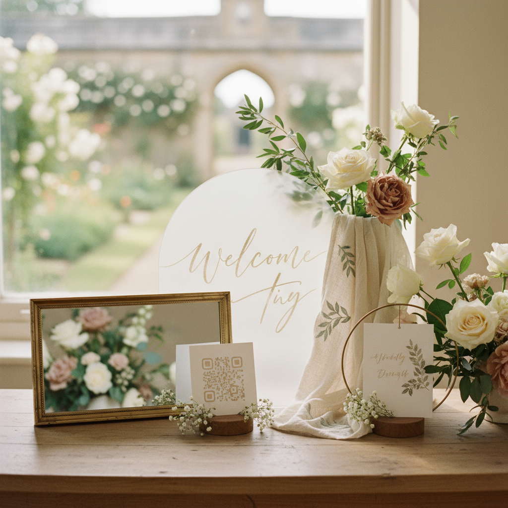
Wedding Sign Trends 2026: QR Codes, Fabric Banners, and Mixed Materials
One of the clearest wedding sign trends in 2026 is utility-led signage that still feels elevated. QR code wedding signs are no longer a novelty when they solve a real guest task: sharing photos, opening a digital program, checking the order of events, or pulling up a wedding website without another printed insert.
At the same time, couples are moving beyond flat one-material suites. Fabric banners, oversized arched signs, and mixed-material combinations such as wood with metallic lettering or acrylic with fabric accents are showing up more often because they create texture without making every piece feel heavy. The strongest versions still keep the layout simple and the contrast high.
Trend 3: Warm Neutrals Still Lead, but Green Stays Strong
Color is becoming more venue-aware. Instead of hyper-specific palettes on every piece, couples are anchoring signage in a neutral base and using one color family for the accent system.
The combinations showing the most momentum are:
- warm ivory with espresso or charcoal text
- sage green with cream and soft stone
- terracotta or burnt orange with sand and almond
- muted black with soft metallic accents
These palettes work because they survive different lighting conditions well and reproduce more predictably when printed. If you want a directional page for a color-first approach, start with sage green wedding signs or burnt orange wedding signs.
Trend 4: Welcome Signs Stay Dominant
Welcome signs remain the page and sign type with the most visual weight. That is unlikely to change because they handle the first impression, the broadest photo coverage, and the clearest personalization.
What is changing is how couples are using them. Instead of packing them with flourishes and multiple decorative elements, most current-looking welcome signs use:
- one strong headline
- names and date only
- minimal supporting copy
- a layout that can be repeated in the rest of the suite
If you only have time or budget for one sign to feel especially current, make it the welcome sign. Then let the rest of the suite echo it. Our wedding welcome signs page covers sizes, wording, and material fit.
Trend 5: Utility Signs Are Getting Better Design Attention
Bar menus, seating charts, directional signs, and unplugged signs are no longer treated like afterthoughts. Couples increasingly want these pages to feel like part of the same design system rather than functional extras.
That matters because utility signs tend to be the most used and the most scrutinized by guests. The trend is not more decoration. The trend is better hierarchy.
For example:
- seating charts need cleaner grouping and more generous spacing
- directional signs need stronger contrast and faster scanning
- bar menus benefit from shorter drink names and fewer typographic styles
- unplugged signs work better with softer, more human wording
The practical side of the trend matters as much as the visual one. If readability breaks, the sign feels dated immediately.
Trend 6: Fewer Signs, Better System
One of the healthiest 2026 trends is restraint. Couples are getting more selective about what signs they truly need. Instead of printing a sign for every surface, they are prioritizing the pieces that solve a real guest task or create a visible focal point.
The lean sign suite that still feels complete usually includes:
- welcome sign
- seating chart or escort display
- bar or menu sign
- directional sign if the venue flow requires it
- table number signs
If you are still deciding what belongs in your suite, start with the wedding sign checklist before you design anything else.
What to Avoid if You Want a Current Look
Several choices make sign suites feel older than they are:
- too many fonts on one sign
- low-contrast script over busy backgrounds
- mirror used everywhere, including hard-to-read placements
- oversized copy blocks
- trend-heavy colors without a neutral anchor
- ornamental flourishes that do not repeat elsewhere
Most of these are not style mistakes. They are system mistakes. A 2026-looking sign suite feels intentional because every page belongs to the same family.
How to Turn the Trends Into a Real Sign Suite
Use this order if you want the current look without overthinking every design decision:
- Choose the venue mood first.
- Pick the dominant material family.
- Lock typography before decorative accents.
- Design the welcome sign first.
- Reuse that system on the rest of the sign types.
That process makes it easier to stay modern because you are building one coherent set, not chasing five unrelated ideas.
If you want to test a 2026-style suite quickly, open the AI wedding sign creator and prototype the welcome sign first. Then apply the same direction to your reception signs, seating chart signs, and bar menu pieces.
Keep Exploring
Boho Wedding Signs
See how one of the strongest 2026 style directions works in practice.
Minimalist Wedding Signs
Typography-led suites are one of the clearest current trends.
Welcome Sign Ideas
Apply the trend direction to the sign type with the most visual weight.